

No products in the cart.
Return To Shop


Data Analytics
What is a Pareto Chart?
In the world of quality control and data analysis, the Pareto chart stands out as a powerful tool. Named after the Italian economist Vilfredo Pareto, who introduced the 80/20 principle, this chart is instrumental in identifying the most significant factors in a dataset. This detailed and explanatory article will explore what a Pareto chart is, how to construct one, and how to analyze and interpret the results effectively.
Understanding the Pareto Chart
A Pareto chart is a type of bar graph where the values being plotted are arranged in descending order. This chart is used to highlight the most important among a set of factors. The principle behind the Pareto chart is based on the Pareto Principle, also known as the 80/20 rule, which suggests that roughly 80% of effects come from 20% of the causes.
Key Components of a Pareto Chart
- Bars: Represent individual values in descending order.
- Line Graph: Shows the cumulative total of the values, plotted as a secondary axis.
- Categories: Typically factors or causes of problems.
- Frequency: The count or number of occurrences of each category.
Constructing a Pareto Chart
Creating a Pareto chart involves several steps:
- Identify Categories: List the factors or causes to be analyzed.
- Collect Data: Gather data on the frequency or impact of each category.
- Order Data: Arrange the categories in descending order of frequency or impact.
- Calculate Cumulative Percentages: Determine the cumulative percentage for each category.
- Draw the Chart:
- Plot bars for each category in descending order.
- Add a line graph representing the cumulative percentage on a secondary y-axis.
Consider a manufacturing company that wants to identify the main causes of defects in their products. After collecting data, they find the following defects: scratches, dents, misalignments, and cracks. Here’s how they can create a Pareto chart:
- Data Collection:
- Scratches: 50 occurrences
- Dents: 30 occurrences
- Misalignments: 15 occurrences
- Cracks: 5 occurrences
- Order Data: Scratches (50), Dents (30), Misalignments (15), Cracks (5).
- Cumulative Percentages:
- Scratches: 50 (50%)
- Dents: 80 (80%)
- Misalignments: 95 (95%)
- Cracks: 100 (100%)
- Drawing the Chart:
- Bars represent the number of occurrences.
- A line graph shows cumulative percentages (50%, 80%, 95%, 100%).
import matplotlib.pyplot as plt

# Data for the Pareto Chart example
categories = ['Scratches', 'Dents', 'Misalignments', 'Cracks']
occurrences = [50, 30, 15, 5]

# Calculate cumulative percentages
cumulative_occurrences = [sum(occurrences[:i+1]) for i in range(len(occurrences))]
total_occurrences = sum(occurrences)
cumulative_percentages = [occurrence / total_occurrences * 100 for occurrence in cumulative_occurrences]

# Create the Pareto Chart
fig, ax1 = plt.subplots()

# Plot bar chart
bars = ax1.bar(categories, occurrences, color='C0')
ax1.set_xlabel('Defect Categories')
ax1.set_ylabel('Number of Occurrences', color='C0')
ax1.tick_params(axis='y', labelcolor='C0')

# Create a secondary y-axis
ax2 = ax1.twinx()

# Plot cumulative percentage line graph
line = ax2.plot(categories, cumulative_percentages, color='C1', marker='o', linestyle='-')
ax2.set_ylabel('Cumulative Percentage', color='C1')
ax2.tick_params(axis='y', labelcolor='C1')
ax2.set_ylim(0, 110) # Ensure the y-axis goes up to 100%

# Add title and grid
plt.title('Pareto Chart of Product Defects')
ax1.grid(True)

# Annotate bars
for bar in bars:
    height = bar.get_height()
    ax1.annotate(f'{height}',
                 xy=(bar.get_x() + bar.get_width() / 2, height),
                 xytext=(0, 3), # 3 points vertical offset
                 textcoords="offset points",
                 ha='center', va='bottom')

# Annotate cumulative percentage line
for i, txt in enumerate(cumulative_percentages):
    ax2.annotate(f'{int(txt)}%',
                 xy=(categories[i], txt),
                 xytext=(0, 3), # 3 points vertical offset
                 textcoords="offset points",
ha='center', va='bottom')

# Show the plot
plt.tight_layout()
plt.savefig('/mnt/data/pareto_chart_example.png')
plt.show()
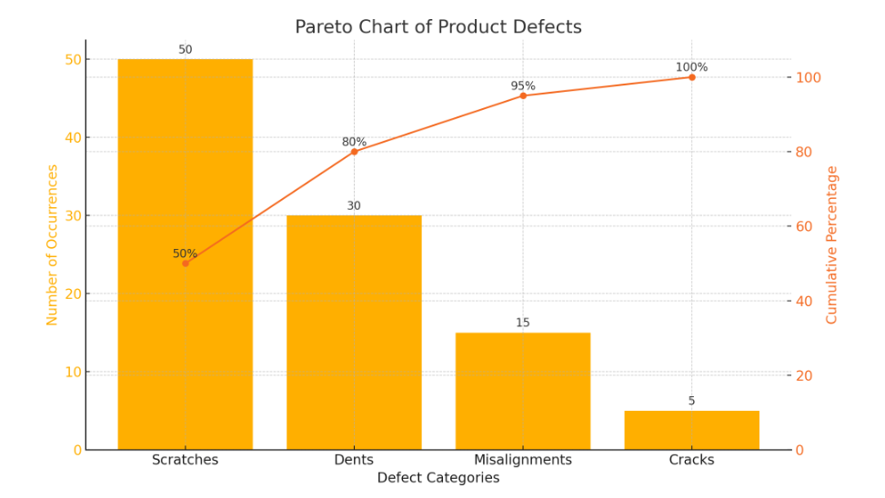
Explanation of the Chart
- Bars: Represent the number of occurrences of each defect category, arranged in descending order.
- Line Graph: Shows the cumulative percentage of the total defects.
- Categories: Scratches, Dents, Misalignments, Cracks.
- Occurrences: The count of each defect type.
This chart clearly indicates that scratches and dents are the major contributors to the defects, making up 80% of the total occurrences. By focusing on these two categories, the manufacturing company can effectively reduce the majority of their product defects.
Analyzing a Pareto Chart
Analyzing a Pareto chart involves looking at both the bars and the cumulative line graph to determine which factors are most significant. The key steps in analysis are:
- Identify Major Contributors: The bars on the left typically represent the most significant factors. In our example, scratches and dents are the major contributors.
- Apply the 80/20 Rule: Check if approximately 80% of the problems are caused by 20% of the causes. In our example, scratches and dents make up 80% of the defects.
- Focus on Improvement: Efforts should be concentrated on the factors with the highest impact to achieve the most significant improvement.
Interpretation Tips
- Look for Patterns: The chart can reveal patterns in data that may not be immediately obvious.
- Comparative Analysis: Use Pareto charts to compare different time periods or processes.
- Root Cause Analysis: Identify the root causes of problems by focusing on the most significant factors.
Practical Applications
Pareto charts are widely used in various fields, including:
- Quality Control: Identifying the most common sources of defects.
- Business Management: Prioritizing customer complaints or sales issues.
- Healthcare: Analyzing patient complaints or medical errors.
- Manufacturing: Improving production processes by focusing on the most significant issues.
Conclusion
The Pareto chart proves invaluable for identifying and prioritizing problems based on their frequency or impact. By concentrating on the most significant factors, organizations can allocate resources and efforts more effectively, leading to substantial improvements. Therefore, understanding how to construct, analyze, and interpret a Pareto chart becomes essential for anyone involved in quality control, data analysis, or process improvement.
Furthermore, leveraging the power of the Pareto Principle allows businesses and organizations to drive efficiency and effectiveness. By addressing the most critical issues with precision and confidence, they can make significant strides in improving their processes and outcomes.